
Visual Identity
The world and how we move is always evolving – yet what drives us forward remains constant. Service, connection, and making bold progress that solves for the real needs of people. Our founding values started our journey and will continue it. We asked ourselves – what if we created an identity that celebrates the incredible journey we’ve been on? One that expresses our values as a continuous pathway between our legacy and what’s to come?
Logos
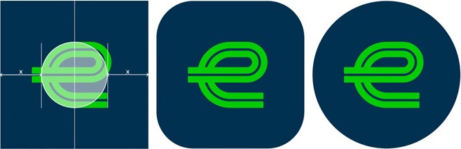
From the very beginning, we have always been inspired by the journey. It was always more than an 'e.' It is a perfect metaphor for the journey of our business. Both where we’ve come from, but more importantly, where we are going. After three generations of leadership we are re-introducing this iconic logo, in a modern holistic brand system. It is a visual mechanic to frame what we’re most proud of, reflect the environments of our customers, and our 90,000+ strong team. Reintroduced, refined, and a reminder that we’re not ones to rest on legacy, but we use it to propel us to the future.
Our Mark is inspired by the strength of our heritage, and the iconic dual parallel lines from the original Enterprise Leasing logo. The visual language of the original ‘e’ serves as a metaphor for the road ahead, or ‘the journey’. This honors our legacy while driving clear forward momentum.
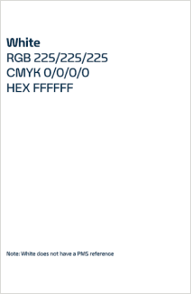
If you have a need for a logo file, please email brandexperience@em.com.
Primary Logo
The Primary Logo is the logo that should be used most commonly. It should be the first choice for all logo applications.
Secondary Logo
The Secondary Logo is our vertical format logo. We use this logo in instances when the layout is portrait, square or very narrow. Color Usage and the Safety Area on the Secondary Logo follows the same convention as our Primary Logo.
Program, Product and Department Logos
In certain situations the development of a program, product or department logo may be appropriate. If you think you may have a use case that warrants a logo, please contact brandexperience@em.com. You should never create a logo on your own.
Don’ts – Mark and Logo Practices to Avoid
Colors
Primary Color Palette
Our color palette distinguishes us as Enterprise Mobility. The bold combination works in harmony to capture a quintessential balance between trusted expertise, grounded optimism, and a striking spirit of innovation. Together, our colors help create a recognizable, confident and consistent visual identity.
Typography
When we set out to create a typeface that was unmistakably Enterprise Mobility, our own history was our greatest source of inspiration. Sweeping curves meet decisive forward direction rooted in the fluid yet intentional form of the 'e' mark. Each letter draws inspiration from the foundation of mobility: the open road. In every detail, from tails to crossbars, we integrate horizontal progression that draws the eye onward. As a result, our typography strikes an important balance between functionality and distinct character.
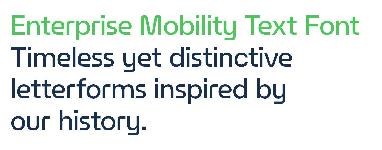
Our preferred font is our custom Enterprise Mobility Text Font. Continue reading for instructions on how to download and install. Certain tech platforms, however, such as Microsoft Outlook, will not support our custom font. In such instances, our universal font is Helvetica Neue.
Enterprise Mobility Text Font Download & Installation
The Enterprise Mobility Text Font package can be downloaded here.
Desktop Installation Guide
File formats: OpenType (.otf) for macOS and Windows desktop software.
Web Usage Guide
File formats: Web Open Font Format (.woff and .woff2) for all modern browser platforms.